
Why New York Firms Are Reworking Company Profiles
A lot of businesses in New York are quietly redesigning their company profiles right now. Not because it suddenly became trendy, and not because somebody told them to. Most of the time, it starts after a meeting, a proposal, or an investor presentation that just did not land the way they expected.
The company itself may be solid. The work may already speak for itself. But the presentation document tells a different story.
That disconnect has become easier to notice in places like Manhattan Midtown and Hudson Yards, where real estate and technology firms constantly compete for attention. Companies are putting serious effort into websites, branding, office spaces, and marketing, though many still send outdated company profiles during important conversations.
And clients notice it immediately.
A profile that feels cluttered, difficult to read, or visually old can quietly affect how people see the business behind it.
The Problem Usually Starts With an Old PDF
Many businesses are still using company profiles made years ago.
The layout feels crowded.
The typography looks inconsistent.
Pages are overloaded with text.
Nothing flows properly.
Some profiles almost feel like copied presentations stitched together over time.
One real estate team near Hudson Yards realized this during a pitch meeting earlier this year. They were presenting a residential development project to outside investors. Their team had strong numbers, strong planning, and good market positioning. Though halfway through the presentation, they noticed people were paying more attention to asking where information was located instead of discussing the project itself.
The profile became the distraction.
Later, they reworked the document completely. Cleaner structure. Better pacing. More organized sections. Less unnecessary text.
The reaction changed almost immediately.
Meetings felt smoother. Clients stayed engaged longer. The material became easier to present internally as well.
That situation is becoming pretty common.
New York Businesses Are Paying More Attention to Presentation
In cities like New York, presentation carries more weight than people sometimes admit.
Especially in industries tied to investors, partnerships, and corporate decision-making.

A technology company around Wall Street may only get one opportunity to send company material before a serious conversation happens. A real estate firm pitching large-scale developments may share company profiles across multiple stakeholders before meetings even begin.
People form opinions quickly.
And honestly, most decision-makers have already seen enough polished branding from competitors that weak presentation stands out faster now.
This is one reason many firms are redesigning documents that once felt acceptable a few years ago.
Not every business needs an overly flashy company profile. That usually creates a different problem. What companies actually want is something that feels structured, clean, modern, and easier to move through.
A lot of clients describe it similarly after redesigning their materials.
They say things like:
- it finally looked professional
- the structure felt cleaner
- clients responded better
- presentations became easier
- it matched the company properly
Those reactions matter more than trendy design effects.
Why Generic Templates Usually Fall Short
One issue that keeps showing up is overuse of templates.
Businesses download a layout, replace text, add a few images, and assume the document is ready. The result usually feels disconnected from the company itself.
This happens often with growing tech startups.
The website may look modern.
The branding may feel polished.
Though the company profile still looks generic.
Clients notice these inconsistencies more than businesses expect.
A company profile should feel connected to the overall identity of the business. Not like a separate file designed in a hurry before a meeting.
This becomes even more noticeable in competitive areas like Manhattan Midtown where companies regularly present materials to investors, partners, and enterprise clients.
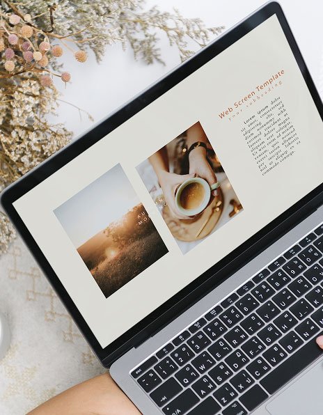
Modern Company Profiles Feel Different
The strongest company profiles today usually focus less on decoration and more on readability.
That change matters.
A profile should guide someone naturally from one section to the next instead of overwhelming them immediately.
The strongest layouts often use:
- better spacing
- stronger hierarchy
- cleaner typography
- shorter content blocks
- more intentional pacing
The difference sounds small until you compare two documents side by side.
One feels exhausting.
The other feels easy.
And when someone reviews dozens of presentations every month, ease matters a lot.
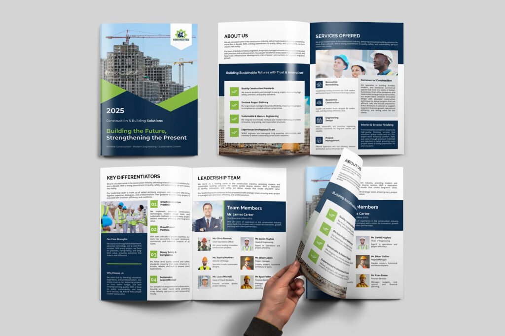
Real Estate Firms Are Taking This More Seriously
Real estate companies in New York have become especially aware of presentation quality over the last few years.
Property presentations now compete visually at a much higher level than before. Developers, agencies, and investment groups are presenting projects with highly polished materials across digital and print formats.
An outdated company profile can make the business itself feel behind, even when the projects are strong.
That is why many firms around Hudson Yards and surrounding business districts are refreshing older presentation materials completely instead of applying small edits every year.
They want consistency between:
- brand identity
- website
- brochures
- pitch decks
- company profiles
When everything feels aligned, the business itself appears more organized.
Technology Companies Face a Similar Issue
Technology firms deal with this differently, though the problem is still similar.
A lot of tech companies struggle with over-explaining everything inside their company profile. Long paragraphs, too much technical language, and overloaded slides make the document harder to absorb.
Clients usually do not want to read a wall of information before understanding what the company actually does.
Good editorial structure fixes this quickly.
Clear sections.
Better flow.
Smarter pacing.
That alone can completely change how the material feels during presentations or investor discussions.
One thing many growing companies underestimate is how strongly design affects confidence internally too. Teams present better when the material itself feels polished and easier to navigate.
What Makes a Company Profile Feel More Professional?
It usually comes down to clarity more than complexity.
The strongest profiles tend to:
- organize information properly
- maintain visual consistency
- avoid overcrowded layouts
- keep typography readable
- create breathing space across pages
And maybe most importantly, they feel intentional.
Nothing feels randomly placed.
Clients often respond strongly to that kind of structure. One recent client described the experience as finally having a document that matched the quality of the business itself. Another mentioned that different team members with completely different tastes all responded positively to the final presentation.
That kind of feedback happens often when the focus stays on readability and communication instead of trendy effects.
FAQs
What should a modern company profile include?
A modern company profile usually includes company background, services, brand story, project highlights, team information, and contact details presented in a visually organized way.
Why are New York real estate firms redesigning company profiles?
Many firms want stronger presentation materials for investor meetings, development proposals, and client-facing presentations.
How long should a company profile be?
Most professional company profiles stay between 8 and 20 pages depending on the business type and audience.
Why does company profile design matter for technology companies?
Technology companies often need to simplify complex information while still looking modern and credible during presentations.
Should company profiles match overall branding?
Yes. Consistent branding across company profiles, websites, and presentations helps businesses look more organized and professional.
Final Thoughts
A company profile may not close deals by itself. Though it absolutely shapes the first impression before conversations move forward.
That is exactly why more businesses across Wall Street, Hudson Yards, and Manhattan Midtown are paying closer attention to how their presentation materials feel.
Not just how they look.
The difference matters.
When the structure feels cleaner, the information becomes easier to present. Clients stay engaged longer. Meetings flow better. The business itself starts feeling more established before anyone even discusses pricing or services.
For companies currently reviewing outdated presentations, looking at professionally structured company profile examples can help clarify what modern editorial design actually looks like in practice.