
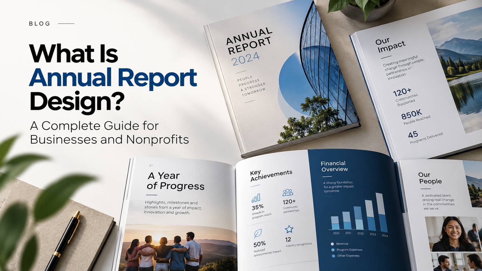
Every year, businesses and nonprofits collect valuable information about their performance, achievements, and future plans. An annual report brings these details together, giving stakeholders a clear picture of the organization’s progress.
But presenting that information effectively is another challenge. Financial statements, performance figures, leadership messages, and organizational milestones can quickly become overwhelming when placed into a lengthy document without proper structure. This is where annual report design makes a difference.
A thoughtfully designed report transforms complex information into a professional, readable, and eye-catching publication. It allows viewers to find important details, understand key results, and connect with the organization’s story.
In this guide, we’ll explore what annual report design involves, what makes it effective, and how businesses and nonprofits can create reports that communicate with clarity.
What is annual report design?
Annual report design is the process of organizing financial, operational, and organizational information into a visually structured publication.
It combines editorial design, typography, photography, data visualization, and brand identity to present information in an accessible format.
Unlike a typical marketing brochure, an annual report often contains substantial amounts of detailed content. Designers must balance visual appeal with accuracy, readability, and consistency.
The goal isn’t simply to create attractive pages. It’s to help readers understand the organization’s performance without having to work through confusing layouts or poorly presented data.
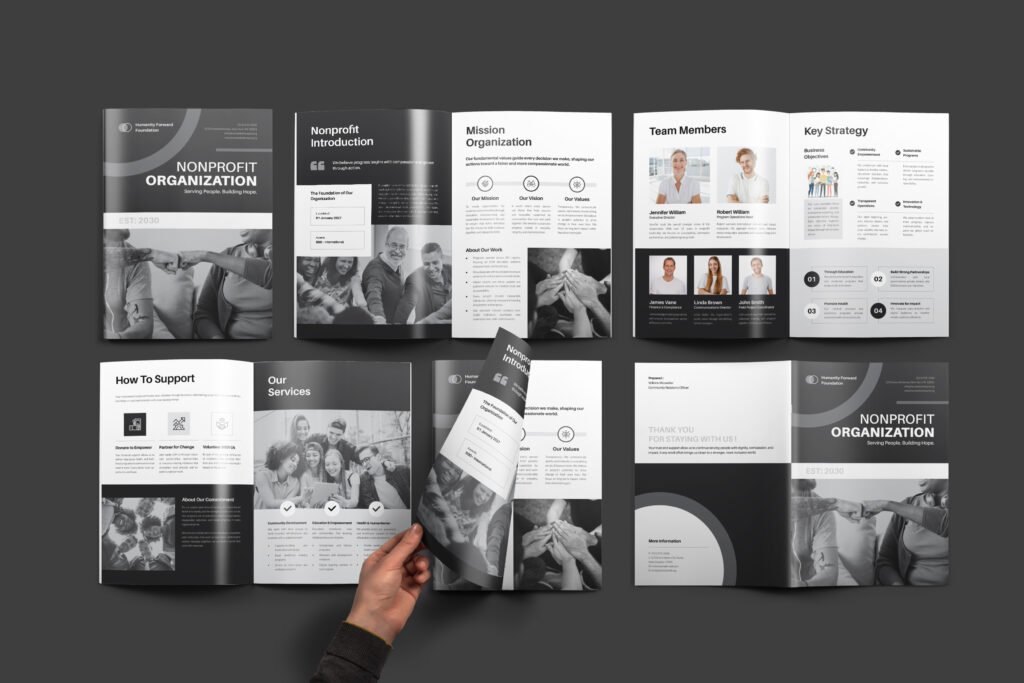
Why does annual report design matter?
An annual report may be reviewed by investors, donors, employees, board members, business partners, or regulatory bodies. Each audience approaches the document with different expectations.
Investors may focus on financial performance, while donors want to understand how their contributions supported meaningful outcomes. Effective design makes this information easier to locate and interpret.
A professional annual report design also reflects how an organization presents itself. Consistent formatting, carefully organized content, and readable financial information demonstrate attention to detail.
Most importantly, a well-designed report respects the reader’s time. It makes essential information accessible without sacrificing the depth that stakeholders expect.
What Makes a Good Annual Report Design?
Successful annual reports don’t follow one fixed visual formula. A financial institution might need a restrained, formal approach, while a nonprofit may benefit from expressive photography and impact-driven storytelling.
However, several fundamental design principles apply across industries.
1. Clear Information Hierarchy
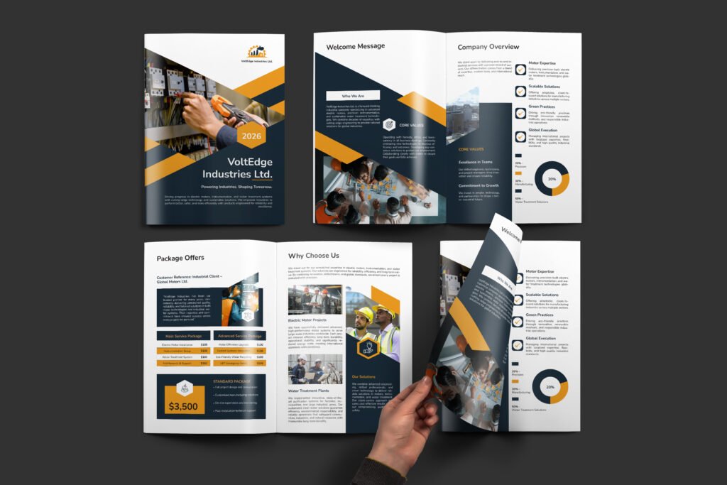
Readers should be able to distinguish major sections, supporting information, and important statistics almost immediately. Headlines, subheadings, body text, captions, and highlighted figures need clearly defined visual roles. This creates a natural reading flow and makes longer documents easier to navigate.
2. Consistent Typography
Typography has a major influence on readability. A well-planned type system establishes consistent styles for headings, paragraphs, financial tables, quotations, and captions. Rather than using numerous fonts, experienced designers create variation through size, weight, spacing, and alignment. The result feels organized without becoming visually monotonous.
3. Thoughtful Page Layouts
Annual reports rarely contain the same type of information on every page. Some sections require detailed financial tables. Others need photography, short narratives, or large statistics. A flexible grid system accommodates these differences while maintaining consistency throughout the publication. Adequate white space is equally important. Giving content room to breathe makes dense information easier to absorb.
Presenting Financial Data Through Visual Design
Financial performance is often one of the most closely reviewed sections of an annual report. However, presenting too many figures without visual organization can make valuable information difficult to interpret.
Charts, tables, and infographics help communicate patterns, comparisons, and changes over time. For example, bar charts can compare revenue across business segments, while line charts are useful for showing performance over several years.
Not every statistic requires a chart. Sometimes a prominent figure with a short explanation communicates the message more effectively. The priority should always be accuracy and clarity. Decorative graphics should never distort the data or make financial information harder to understand.
Storytelling in Annual Report Design
An annual report documents facts, but those facts should connect to a larger organizational story. What were the organization’s priorities? What progress was made? Which challenges shaped its decisions? What comes next?
A compelling report answers these questions through a logical sequence of information. For nonprofits, this may involve introducing the mission, highlighting program achievements, sharing beneficiary stories, and explaining how funding supported measurable results. Corporate reports might focus on strategy, operational milestones, market developments, and future investments.
Design connects these elements through section transitions, photography, visual themes, and carefully placed highlights. This narrative approach helps readers understand the significance behind the numbers rather than viewing them as isolated results.
Annual Report Cover Design and Branding
The cover is the first visual interaction readers have with an annual report. It establishes the publication’s character and introduces the organization’s identity. Some covers rely on expressive typography or photography. Others feature illustrations, abstract graphics, or a defining achievement from the reporting year.
The creative approach should reflect the organization and its intended audience. Brand consistency also extends beyond the cover. Colors, typography, imagery, and graphic elements should remain recognizable throughout the report.
However, consistency doesn’t mean repeating identical layouts on every page. A strong visual system allows enough flexibility to make individual sections distinctive.
The Role of Photography and Imagery
Photography can communicate aspects of an organization’s work that numbers alone cannot. Images of employees, customers, community initiatives, facilities, or completed projects provide context and make the publication feel more personal.
For nonprofits, authentic photographs can be particularly valuable when explaining the real-world impact of programs. Corporate organizations can use imagery to highlight operations, workplace culture, products, and significant developments.
Whenever possible, photography should be relevant to the content rather than included simply to fill space. Meaningful visuals reinforce credibility and give readers a stronger connection to the information presented.
What Is the Annual Report Design Process?
Creating a professional annual report requires more than arranging content in design software. At Graphilence, the process begins with understanding the supplied material and determining how it should be organized.
Content review and planning: The designer examines the report’s structure, identifies content-heavy sections, and determines where charts, photography, or visual highlights may improve communication.
Visual direction: Typography, color palettes, grid systems, and sample layouts establish the overall design approach.
Page development: The approved visual system is applied across the publication, with layouts adapted to accommodate different types of content.
Review and refinement: Feedback is incorporated, and details such as spacing, alignment, tables, and visual consistency are carefully checked.
Final production: The completed publication is prepared according to its print or digital requirements.
A structured workflow helps minimize inconsistencies and makes revisions easier to manage.
Print vs. Digital Annual Report Design
Many organizations publish their annual reports online, while others continue to produce printed editions. Each format has different technical considerations.
Print publications require attention to page dimensions, margins, bleed, image resolution, color settings, and binding. Digital reports prioritize screen readability, manageable file sizes, clickable navigation, and accessible document structure.
Organizations producing both formats benefit from planning these requirements early. This allows the design to remain consistent while ensuring that each version works effectively in its intended environment.
Annual Report Design for Businesses and Nonprofits
Although the design principles are similar, corporate and nonprofit annual reports often have different communication priorities.
Corporate Annual Reports
Businesses typically emphasize financial results, operational performance, governance, strategic initiatives, and future direction. A corporate annual report design should communicate these details with precision while maintaining a professional visual identity.
Nonprofit Annual Reports
Nonprofits generally focus on mission-driven achievements, program outcomes, funding transparency, and community impact. Their reports often benefit from combining measurable results with photography and authentic stories.
In both cases, the design should reflect the organization’s purpose rather than follow visual trends that add little value.
Common Annual Report Design Mistakes
Even a visually appealing report can fall short when essential design principles are overlooked. Common problems include overcrowded pages, inconsistent typography, overly complicated charts, weak section hierarchy, and imagery that doesn’t support the content.
Another frequent issue is beginning the design process before the report’s structure is established. This often leads to unnecessary revisions and uneven layouts.
Addressing information architecture early helps prevent these problems and creates a more coherent final publication.
How Much Does Annual Report Design Cost?
Annual report design costs depend on the page count, scope, and complexity of any project.
A report containing extensive financial tables, custom infographics, illustrations, or complex layouts generally requires more work than a document with straightforward text and photography.
Content readiness, revision requirements, deadlines, and final production formats can also influence pricing. For this reason, designers typically provide project-specific quotations after reviewing the materials and requirements.
Should You Hire a Professional Annual Report Designer?
Annual reports are often among the most substantial publications an organization produces.
Working with an experienced editorial designer can help ensure that lengthy content, financial information, and visual elements remain consistent throughout the document.
Professional design is particularly valuable when a report must communicate detailed information to multiple stakeholder groups. Beyond appearance, the designer develops a cohesive visual system that supports readability, accuracy, and production quality.
Final Thoughts
An effective annual report makes detailed information easier to understand while reflecting the organization’s identity and achievements. Strong typography, structured layouts, meaningful imagery, and accurate data visualization all contribute to a publication that readers can navigate confidently.
Whether you’re preparing a corporate report or documenting nonprofit impact, thoughtful design helps your organization communicate its story with greater clarity.
At Graphilence, we provide annual report design services for businesses, nonprofits, and organizations, creating professional publications for both print and digital use.
Need help designing your next annual report?
Whether you already have finalized content or are still organizing your report, our team can help turn it into a clear, professional, and engaging publication.
